Containerville Rebrand
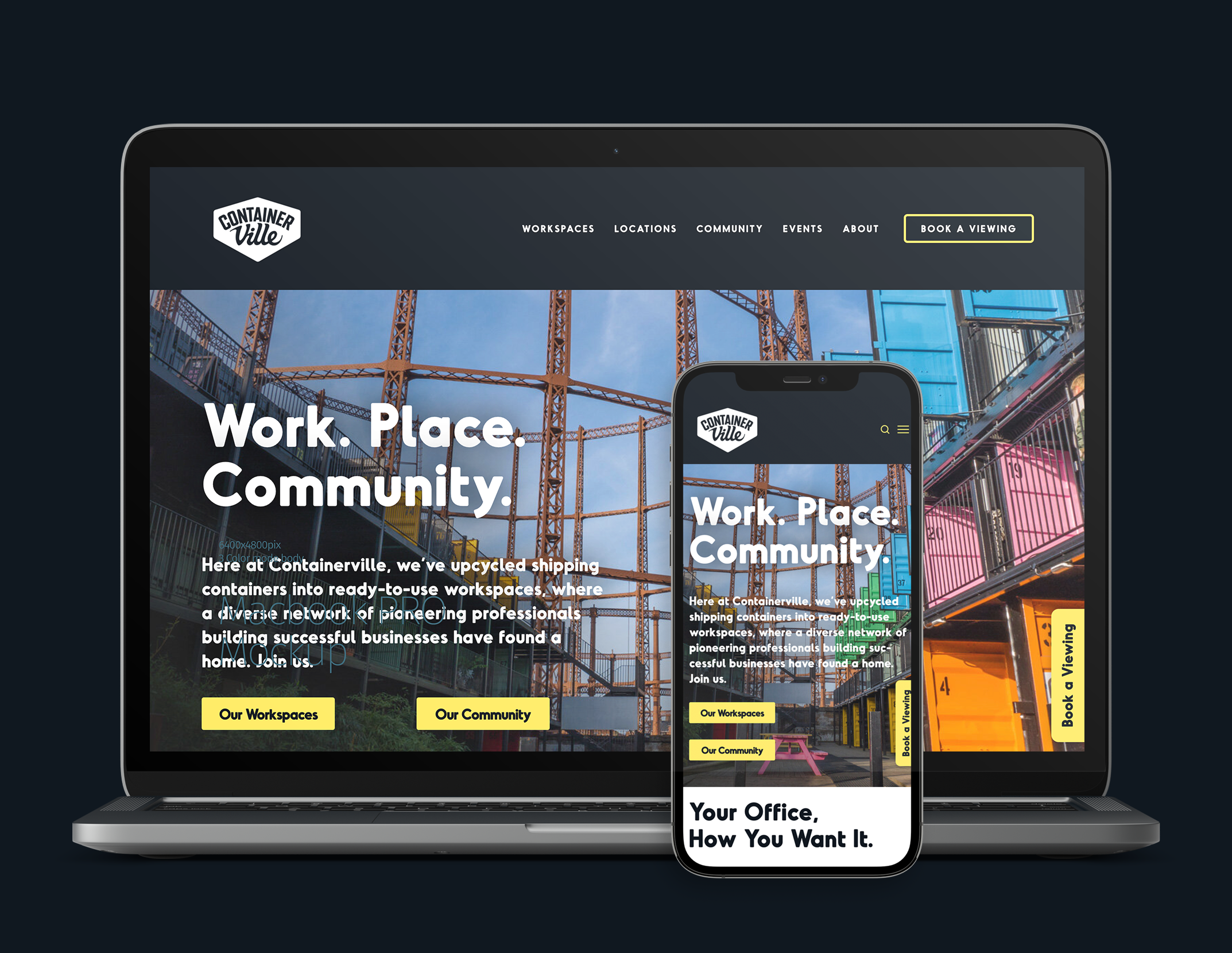
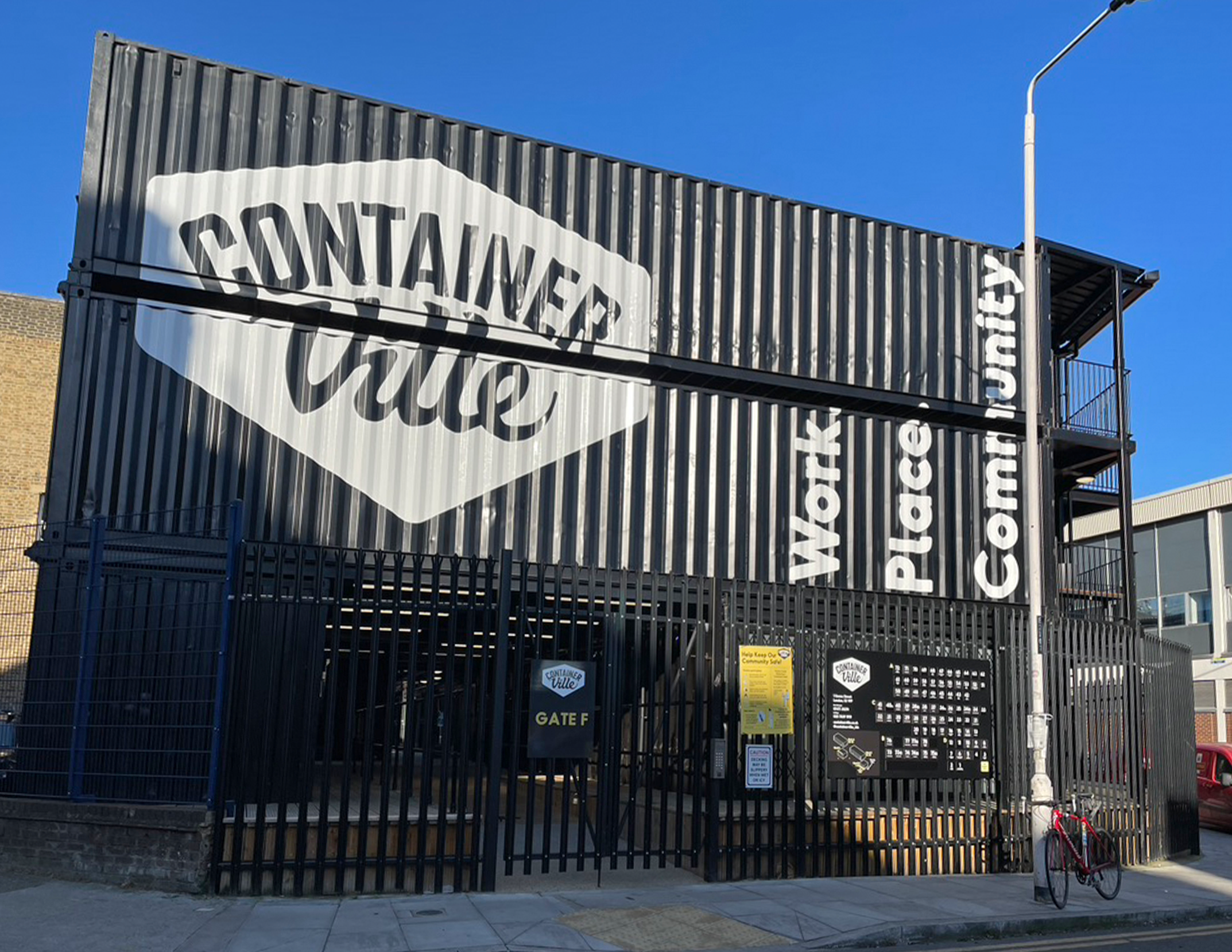


Work. Place. Community. Brand.
The rebrand of this east London work space positioned it as the east London spot for start-ups to locate themselves.
The logo is a matured version of our previous design with the brand around it dark and serious, with dashes of vivid colour. The brand was applied across all of Containerville’s communications; the development itself; signage; social media; outdoor and print marketing.
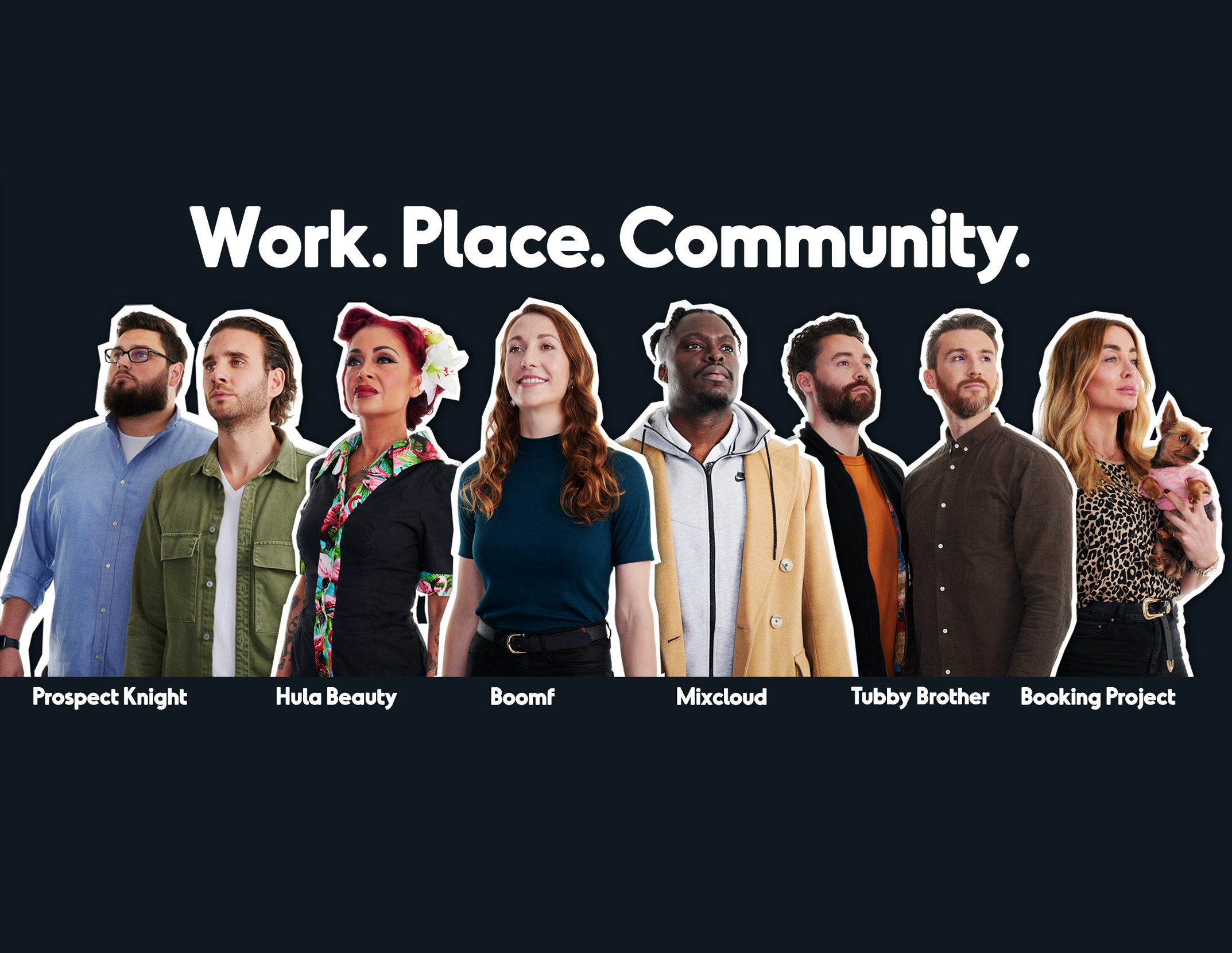
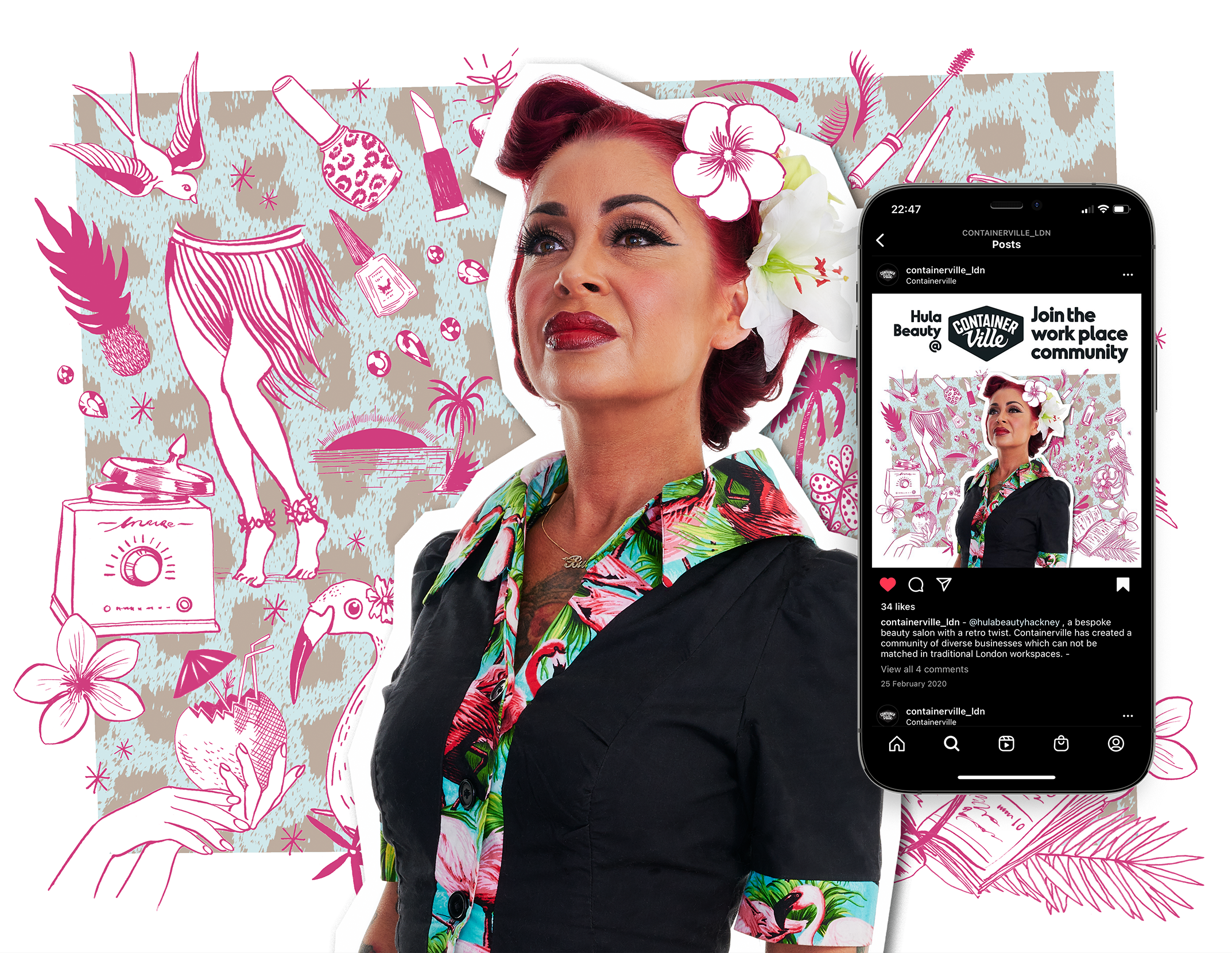
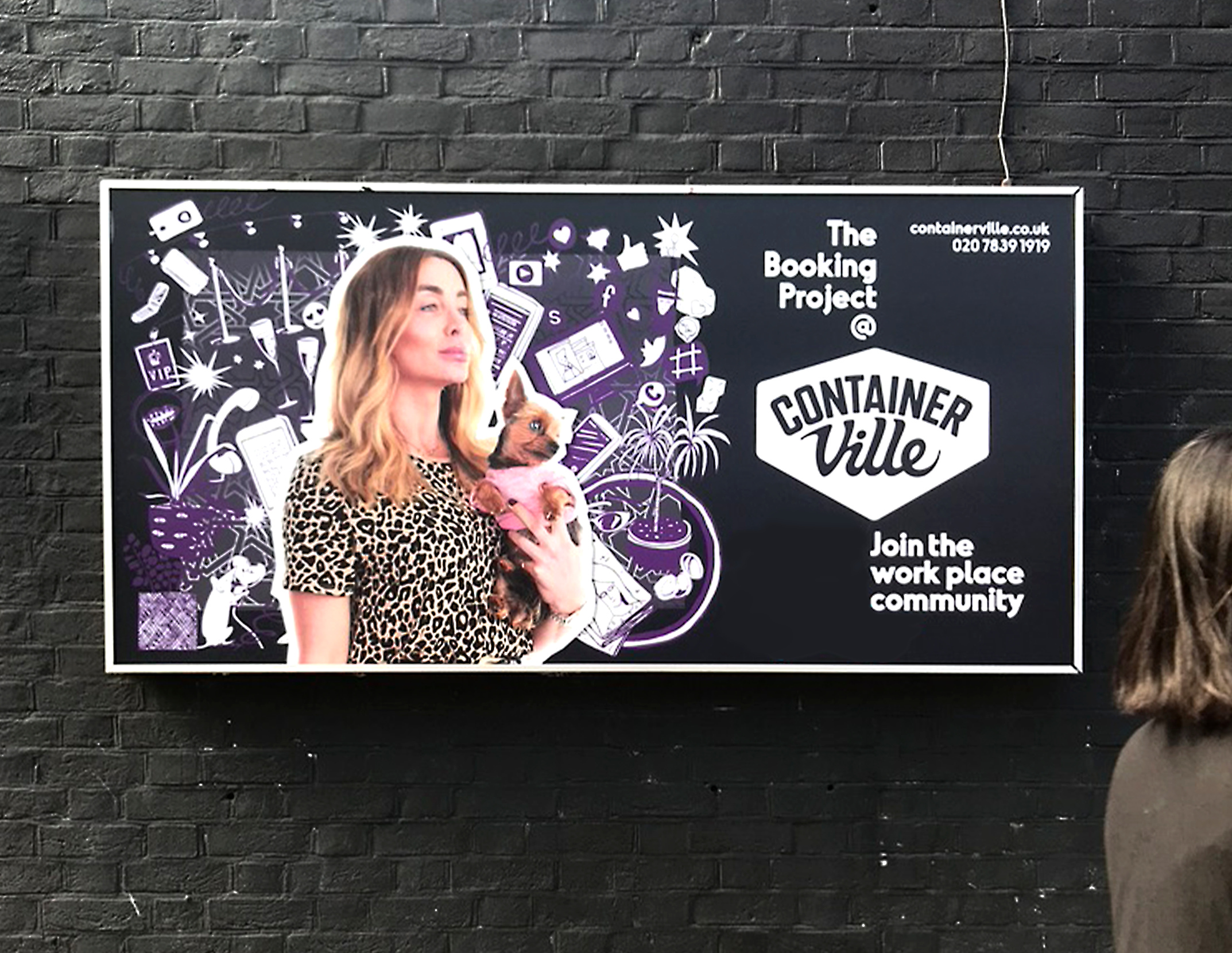
The marketing of the development focused on the Community aspect of the brand with the marketing visuals combining photography of the tenants with illustrations visualising their businesses, and mentioning the names of the businesses directly - suggesting that working from Containerville is a relationship more akin to partnership than landlord/tenant.