Greenpeace:
Santander Campaign
In February 2015 we gave Santander a bit of a shock, remaking their branding on behalf of the Greenpeace Forests Campaign.
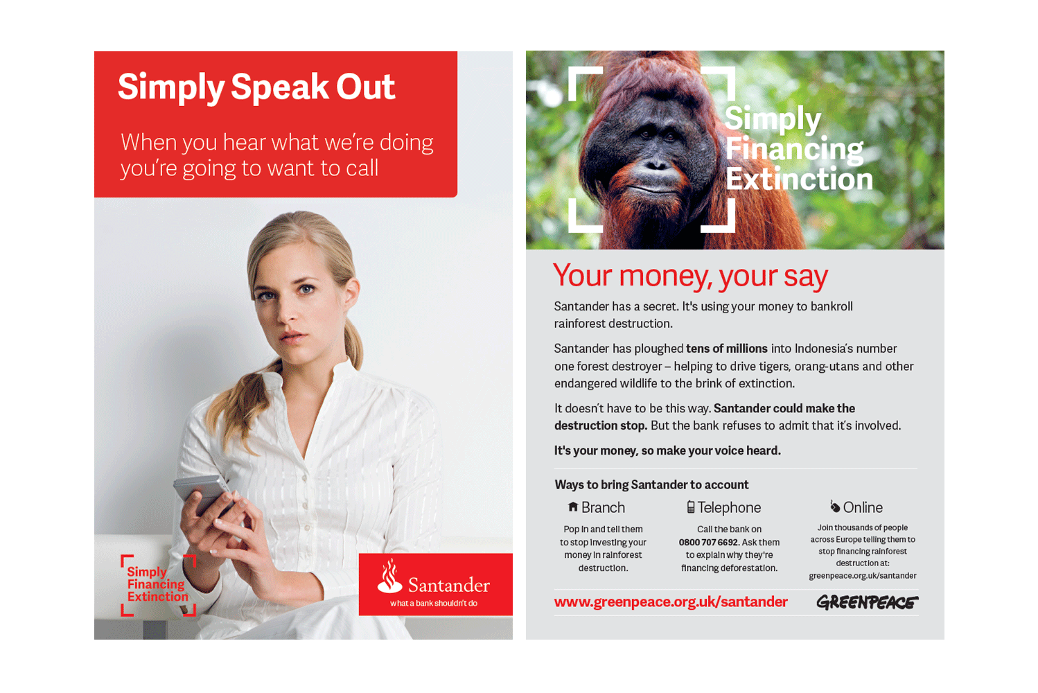
'Simple Personal Fair' and the frame device the bank uses to focus attention on their marketing both seem like innocent enough ideas for a bank in this post-banking-crisis era, but by the time we'd spent some time abusing it their branding and messaging had taken a turn for the negative.
Why? Santander were in the process of making a significant loan to APRIL, a paper company involved in destroying Indonesia's rainforests. Greenpeace wanted to put a halt to that support.
Our work redesigning the Santander brand included:
adding flames to their Logo and underlined it with a new strap-line we created for them "what a bank shouldn't do'
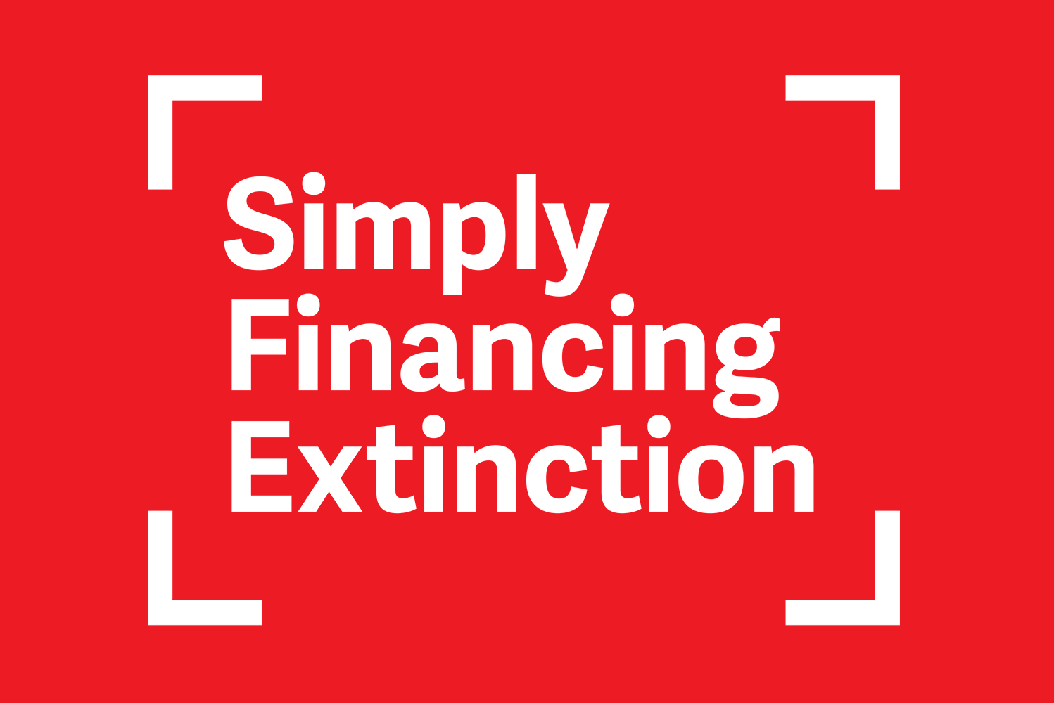
rewrote and designed their headline 'Simple Personal Fair' into 'Simply Financing Extinction'
closely copying their design look and feel so that customers campaign leaflets could be left in branches - to add a touch of style we used a better font than they use- almost identical but actually an improvement
housing that headline in the Santander frame device and adding it to photos of wildlife - mimicking Santander adverts
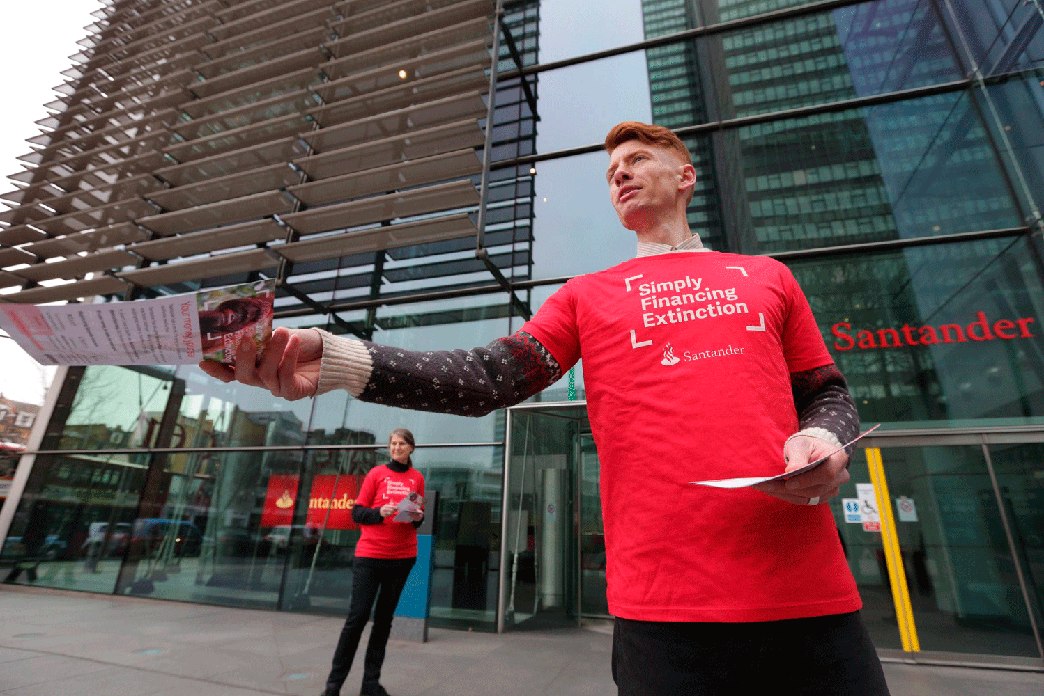
leaflets and t-shirts displaying our new Santander branding with Greenpeace messages
campaign branded petition forms, facebook page headers and avatars.
This campaign was a huge success, Santander decided to postpone making the loan to APRIL after just three weeks.