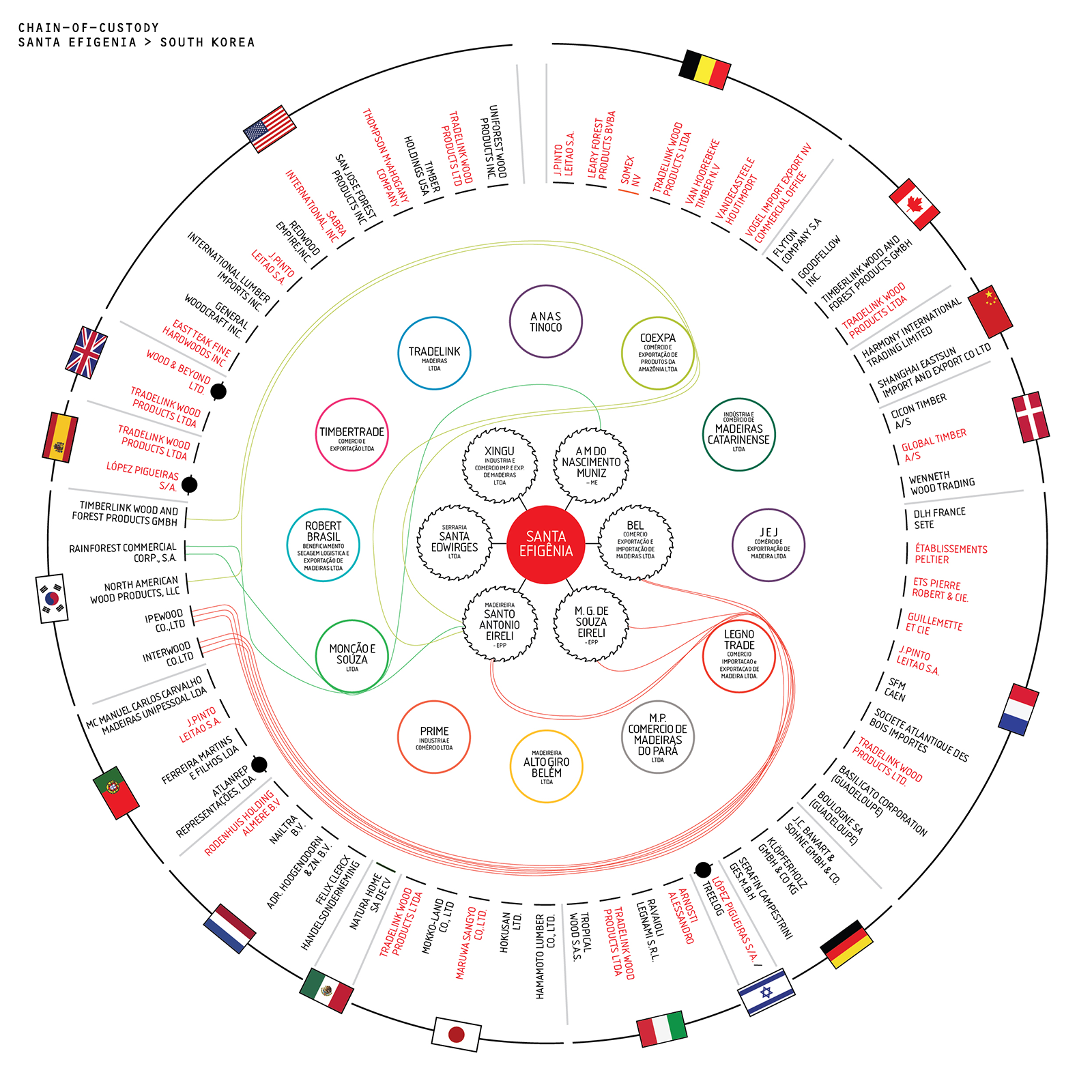
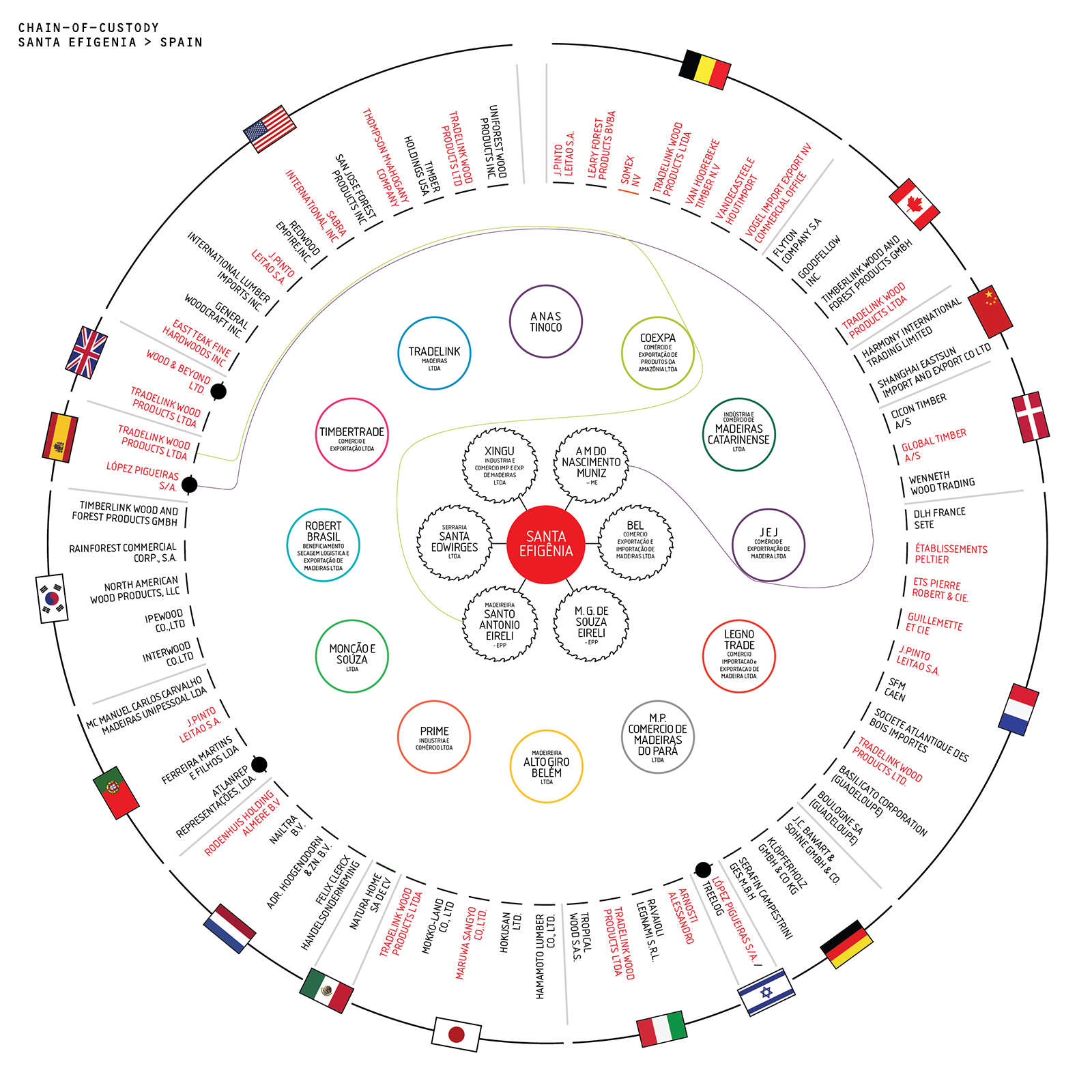
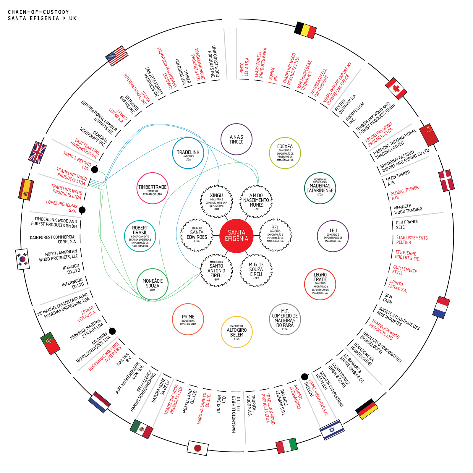
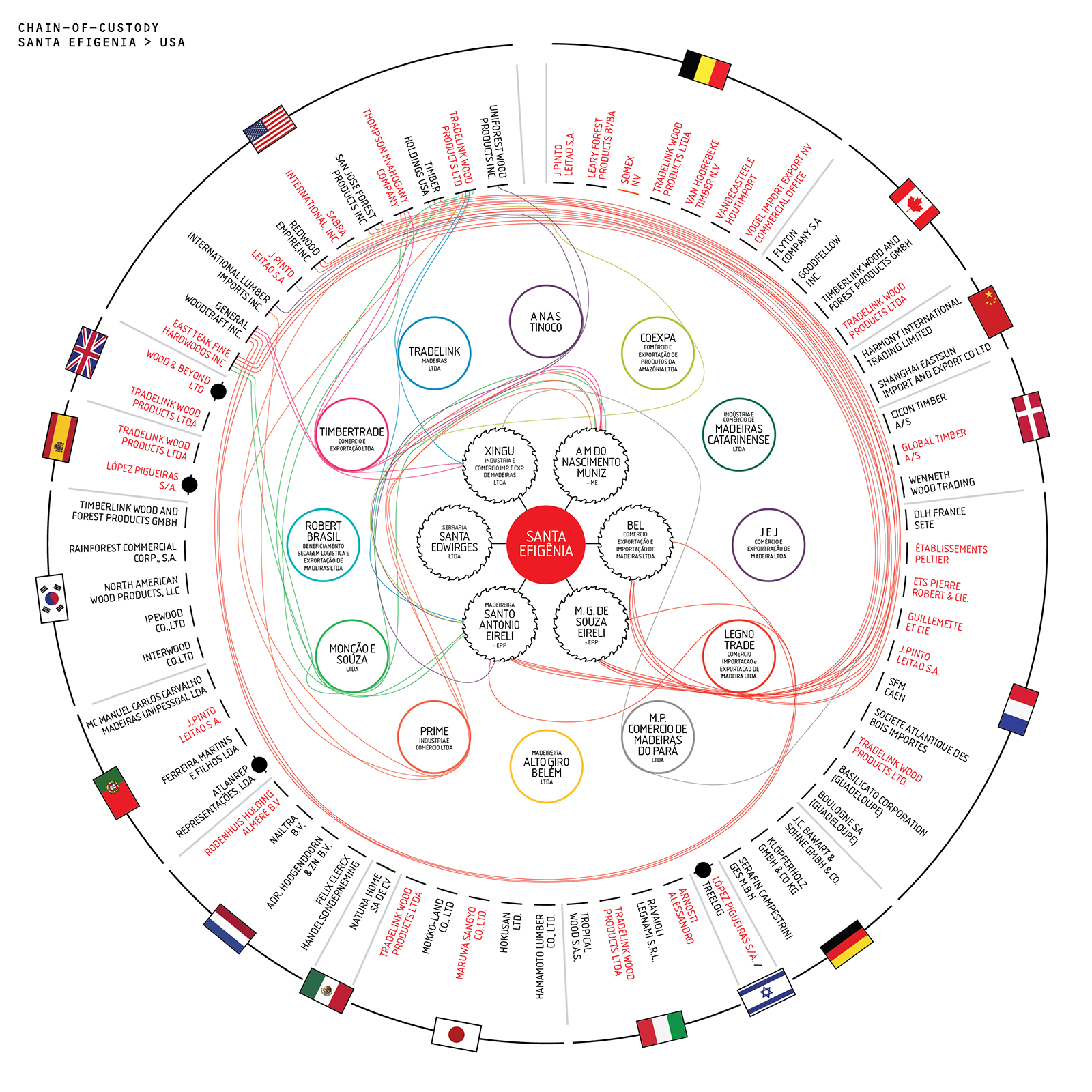
Visualising a Chain-of-Custody
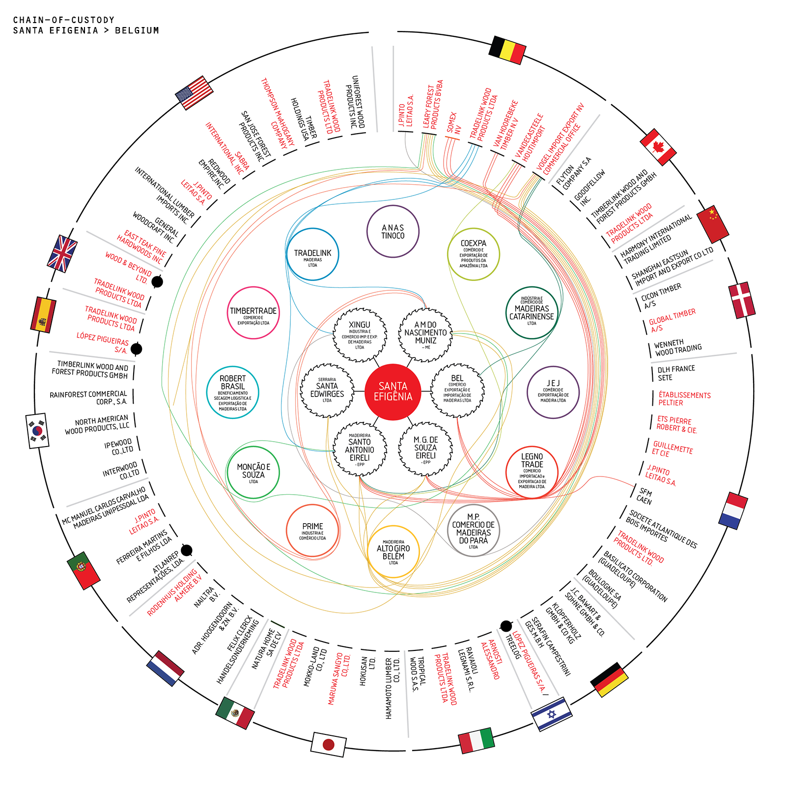
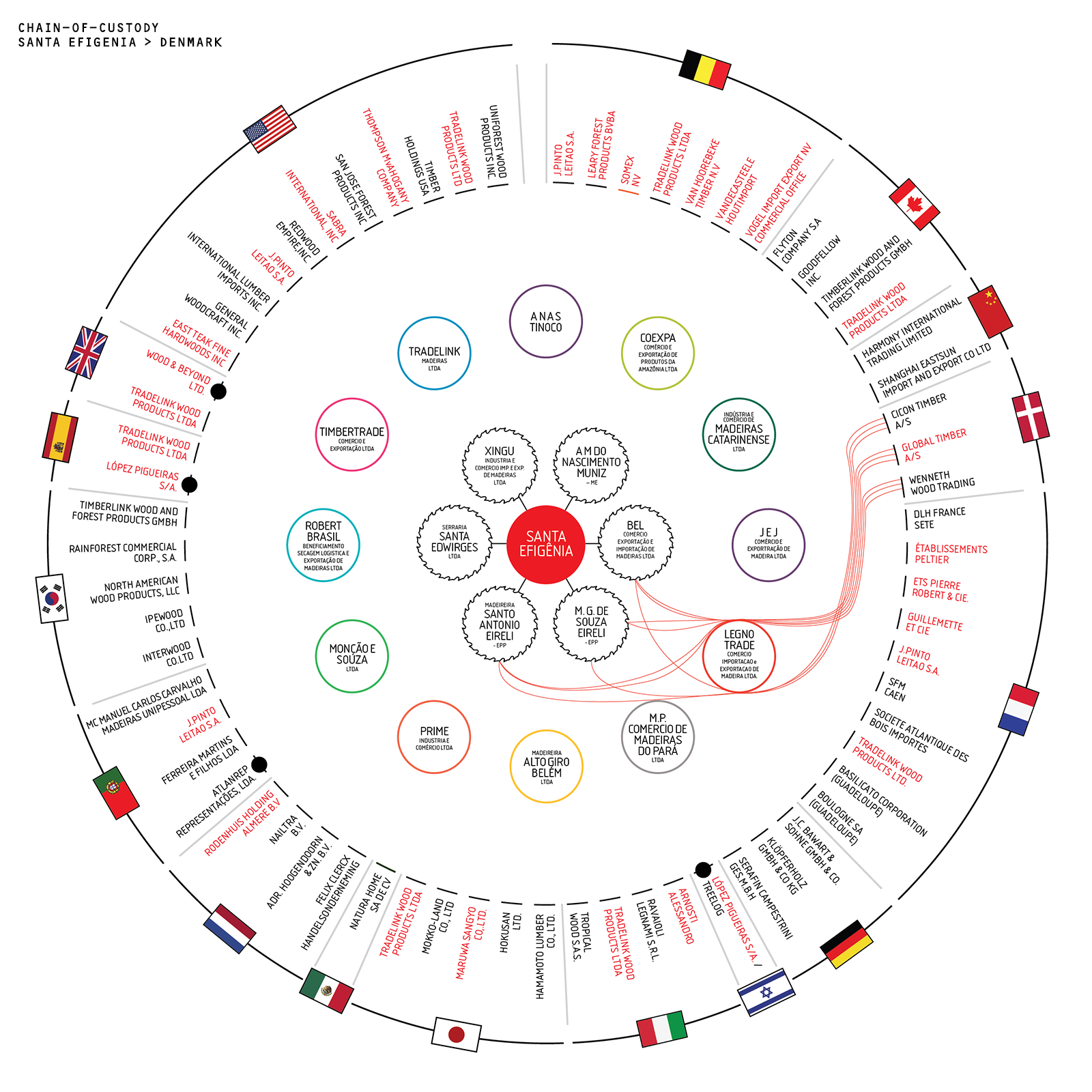
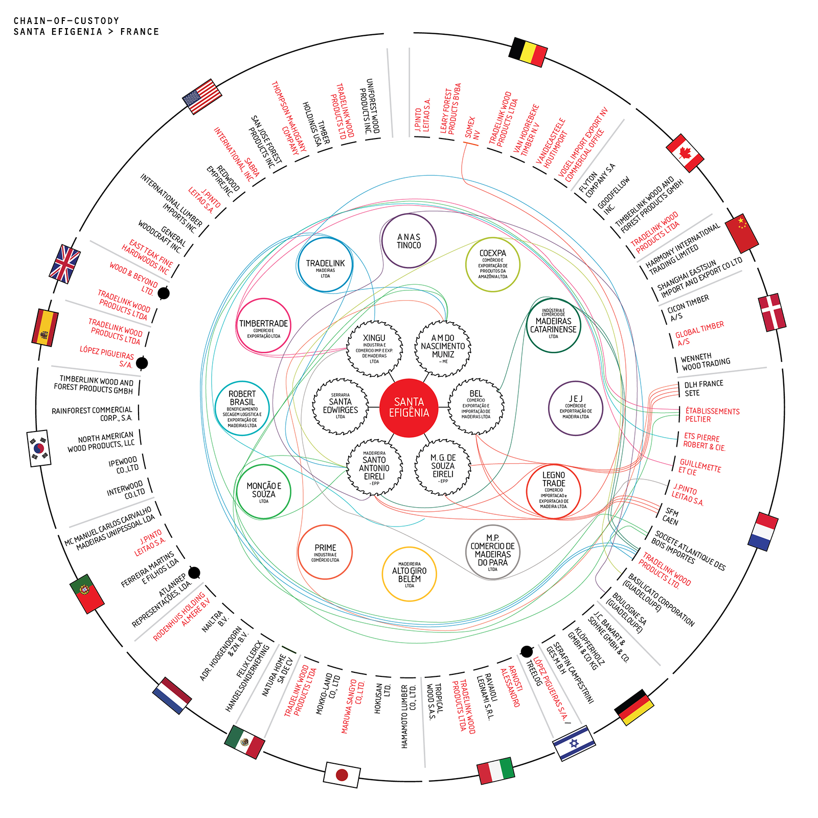
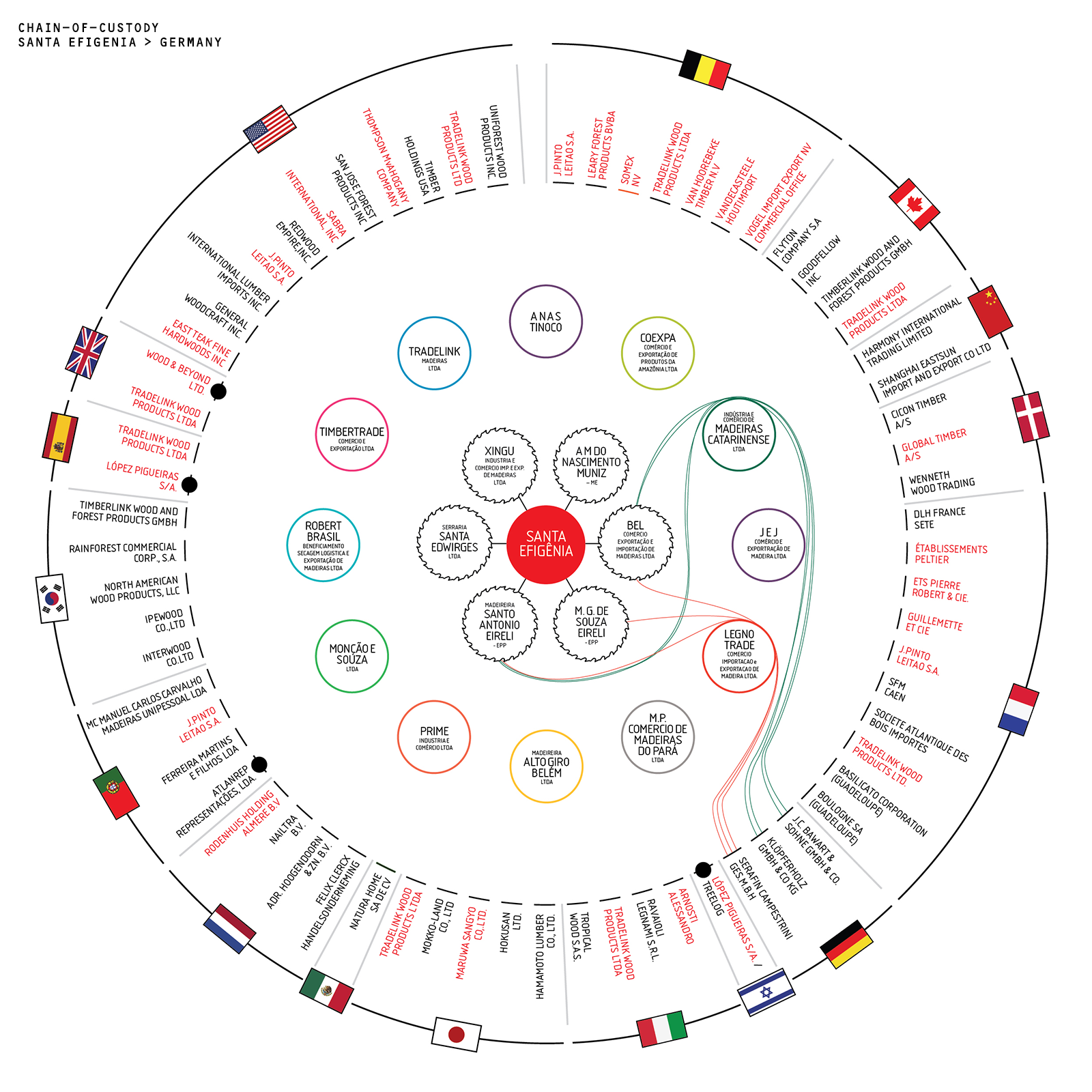
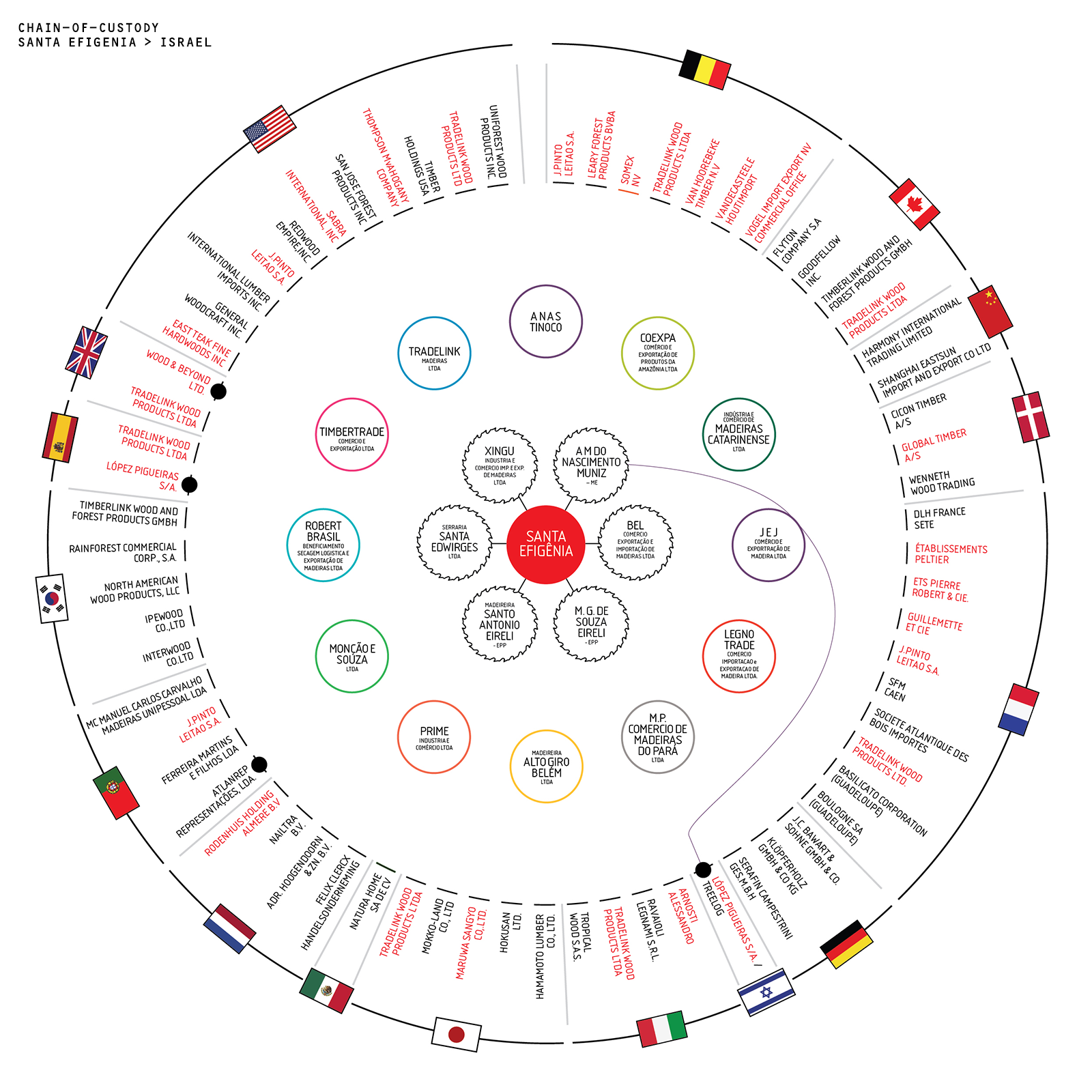
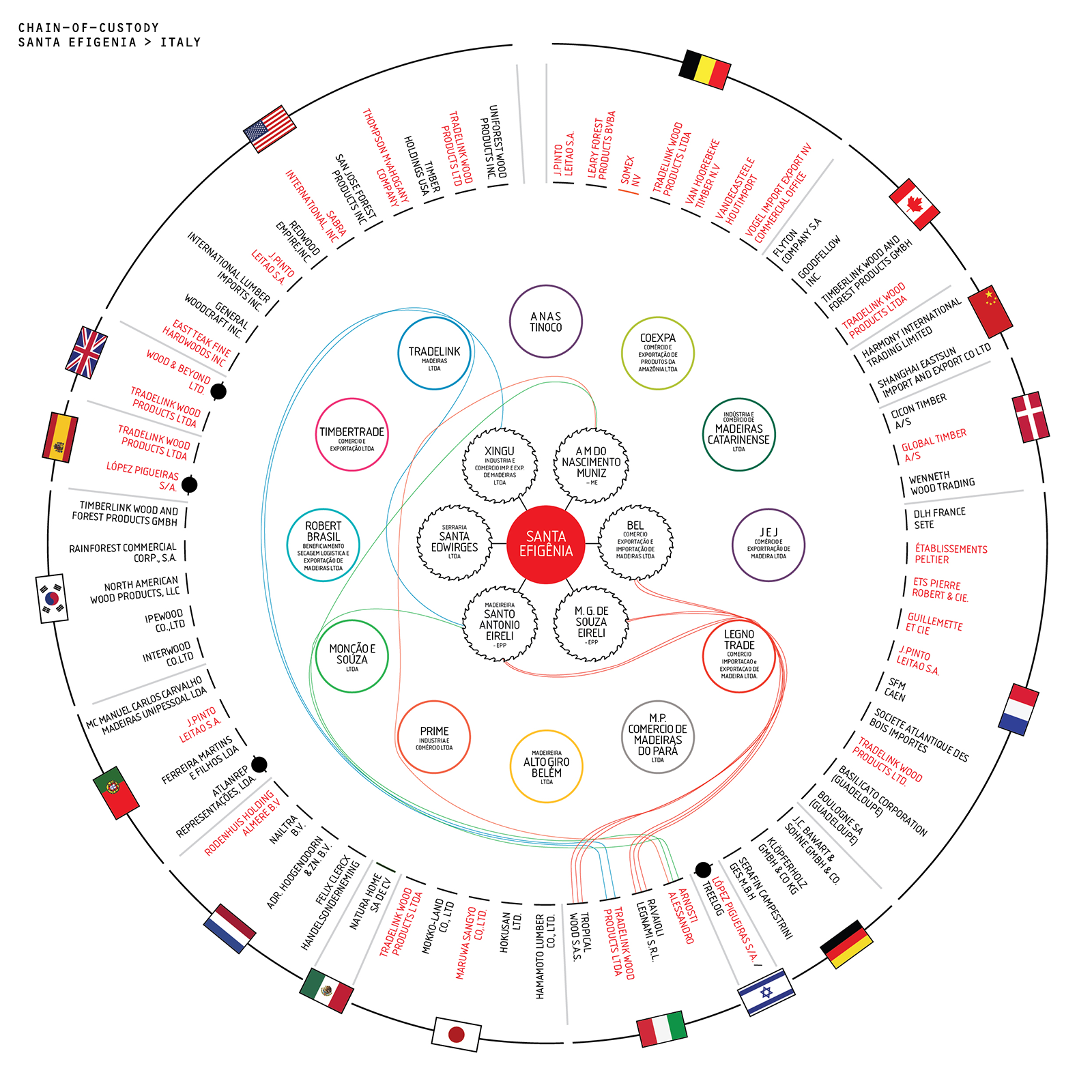
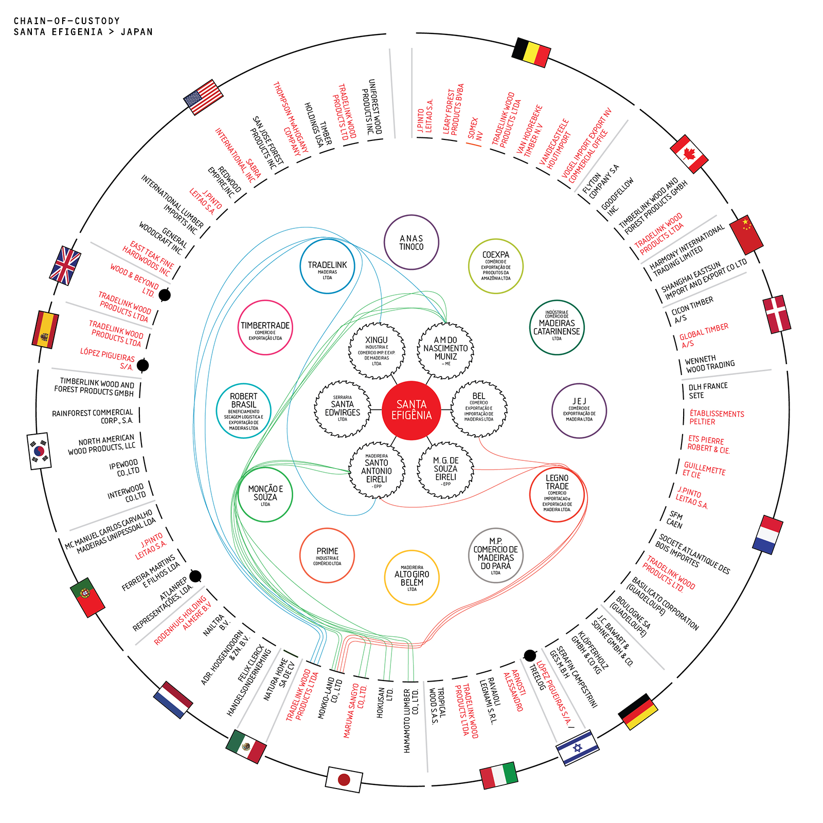
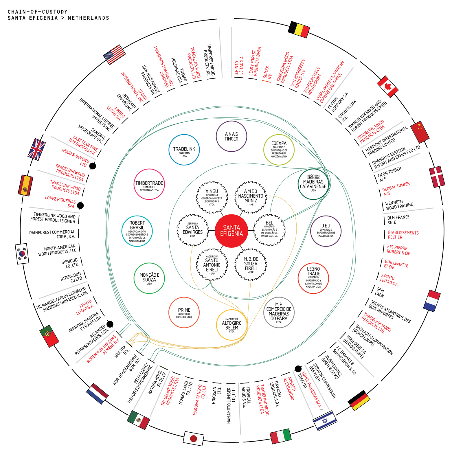
Recently we were tasked to visualise a Chain-of-Custody by Greenpeace, they wanted a diagram to visualise in excess of 170 individual global trade links showing how illegally logged hard-woods are flooding out from one fazenda (farm) in the Brazilian Amazon. This diagram had to work on a single page of A4.


Initial sketches showed that this was not going to be a diagram anyone could follow easily - that's the route we'd prefer - making data easy-to-use - but the sheer volume of trade links made that an impossibility. Going back to the stated aim of the diagram, to explain the volume of timber traded from one place to many places, it became apparent the complexity of this diagram was actually its strength, and that it needed to be a circle.
Instead of attempting to force the data to be clear, the data was better served by creating this flow-diagram you see above, which also doubles as a heat map - indicating which counties and companies are most strongly implicated in the trade.
We then created multiple iterations of the diagram so that campaigners could show individual countries and timber exporters where they are in the chain - a powerful persuasive tool forcing decision makers to witness the details of their own CoC. The countries set of diagrams is below.


You can download the Amazon's Silent Crisis: Licence to Launder here